How Computers Learned to Read
Vicki McKinney, who is blind, uses a scanner to read a screen. Image: Getty

FYI.

This story is over 5 years old.

Tech

How Computers Learned to Read

Teaching computers to understand text was one of the 20th century’s great challenges. At first, the secret to optical character recognition was purpose-built type.

A version of this post originally appeared on Tedium, a twice-weekly newsletter that hunts for the end of the long tail.

We live in a world where facial recognition has become so sophisticated that we're being forced to ask very serious ethical questions about it.

(In the US, the depth of the FBI's facial-recognition capabilities are raising some serious questions from Congress. In China, it's being used to detect toilet paper theft. To each country their own.)

Advertisement

But I want to take a step back from the big hairy ethical questions and consider how we started on this road—with typography.

Optical character recognition, or OCR, is a technology that came up with computing in general. In 1954, the first optical character recognition machine was installed in a business—fittingly, the office of Reader's Digest, though it wasn't used for books.

At the time, the big use of OCR was seen as automating business tasks, and in the case of Reader's Digest, the technology was used to manage subscriber sales data and convert that data into a punch card format.

We've come a long way from this early point—and in a lot of ways, it still feels like magic, even though it's a problem we solved long ago.

The story of OCR, when it comes down to it, is a tale of typography. Here's why.


How the challenges of making fonts readable by machines influenced typography

American Type Founders, a trust of 23 different type foundries that defined typography in the US for decades, has a lot of fonts to its name, many of them incredibly well known and of high-quality. Franklin Gothic, Century Schoolbook? Both of them credited to ATF typographers. (We'll overlook the fact that the company was responsible for Hobo.)

But just one of its fonts has a spot in the Museum of Modern Art's collection, and that font is OCR-A, a typeface created in 1966 to be read for a very specific audience: machines.

Advertisement

And the machines of the time did not have the ability to differentiate between fonts, making such a font necessary. As the 1999 document Optical Character Recognition: An illustrated guide to the frontier explains:

Many of the typefaces used today are derived from medieval calligraphy, only slightly modified by the limitations of early printing technologies (wood blocks and moveable type). To imitate fine penmanship, vertical strokes are thick compared to horizontal strokes, and NW-SE diagonals are thicker than NE-SW diagonals. Therefore curved strokes may vary in width according to their local orientation. In contrast, typefaces specifically designed for accurate OCR, such as OCR-A and OCR-B fonts, have uniform stroke widths and exaggerated distinctions between similar symbols such as Ο and 0 or 1 and l.

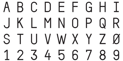
OCR-A wasn't the first font to tackle these machine-scanning issues, but it was a major step forward in that it was a complete alphabet that was readable by both machines and humans. Previously, the most well-known use for such technology involved something you're probably familiar with if you've cashed a check sometime in the last 60 years: Magnetic Ink Character Recognition, or MICR.

Developed in the 1950s by the banking industry, the fonts—there are two, used exclusively of one another in different countries—are made up of the numbers 0-9 and a few specific codes that are designed to communicate specifically to computers. If you're in North America or the UK, you've likely seen E-13B, which relies on unique shapes for each individual character. If you're in France, Spain, or South America, you might be more familiar with CMC-7 font, which integrates white dashes into the numbers. The ink is also magnetically charged to ensure scanners look for the numbers.

Advertisement

Another notable font of this nature is Farrington B, a numeric typeface conceived by early OCR developer David H. Shepard that's still in use to this day on credit and debit cards everywhere.

(These fonts directly inspired other very blocky fonts, such as the one used on the Byte magazine logo, directly leading thick rounded-stroke design to be closely associated with early computing.)

OCR-A, which you might have seen on a piece of junk mail or two over the years, expanded on the basic idea of MICR by creating a character set that could be detected by either a computer or a set of eyes. The problem was, however, that it was a better fit for computers and had a strongly stylized design, which some found not so appealing.

"The result is a font that mixes serif with sans-serif characters, shifts its axes and internal symmetry arbitrarily, and is easy to recognize with its acute angularity," University of Washington associate professor Zach Whalen explained in an essay on the font. "In these ways, OCR-A is an ugly font, but of course that ugliness—a human consideration—makes it less 'invisible' than, say, Helvetica, in a way that links its technical function with its use in graphic design."

That led to a second attempt to take on the problem by Swiss typographer Adrian Frutiger, released in 1968.

Frutiger was tasked to the problem by the European Computer Manufacturers' Association (ECMA), which felt OCR-A wasn't built for humans' sake. In a piece on the Linotype blog, the late typographer, who died in 2015, recalled that he had somewhat of an advantage as OCR reader technology had improved significantly, and was able to pick up finer details. The result is that OCR-B looks far closer in design to a standard European font than OCR-A's more stylized look ever did.

Advertisement

Not that it was easy—Frutiger notes that, for example, it was a challenge to ensure the "8" and "B" characters were read as unique characters.

The fruit of Frutiger's work is what it was eventually picked up as a global standard by the International Standards Organization (ISO), while OCR-A had to settle for the American National Standards Institute's standardization.

These fonts aren't technically necessary anymore—starting in the 1970s, omni-font OCR solutions became common—but they're still used pretty much everywhere.


"I happened to sit next to a blind gentleman on a plane flight, and he explained to me that the only real handicap that he experienced was his inability to read ordinary printed material. It was clear that his visual disability imparted no real handicap in either communicating or traveling. So I had found the problem we were searching for."

— Technologist Ray Kurzweil, describing the chance encounter that gave a purpose the project that he was working on at the time. This led Kurzweil to build his company's technology around this specific use case, the result becoming the Kurzweil Reading Machine. The device could scan a given page, parse the text on the page, and recite it to the person who wanted to read the page. It was a definite upgrade from vinyl books, and it helped generate excitement about OCR technology in the mid-1970s.


Five key points in the evolution of optical character recognition

  • In 1952, onetime National Security Agency employee David H. Shepard started a company called Intelligent Machines Research Corporation to help commercialize a product that could read. "We built it in my attic," he told the Associated Press in 1954.
  • Also in the 1950s, Jacob Rabinow, an employee of the National Institute of Standards and Technology, built a reading machine of his own, this one built on an approach called "best match," which detected the letter by comparing it to every character in the alphabet and suggesting an answer. "It enabled us to read very poor printing that could not be read by any other means," Rabinow recalled. It could only read one character a minute, but soon, it got much better.
  • In 1965, the US Postal Service, which had since 1957 been using a sorting machine built by Rabinow, installed an OCR machine at the Detroit Post Office. The devices, according to a 1970 Post Office video, were expected to read at a speed of 42,000 addresses per hour.
  • In 1980, Ray Kurzweil sold his company Kurzweil Computer Products to Xerox, which further developed his technology into something that proved valuable to the business world. The base company, later sold off by Xerox, still exists to this day under the name Nuance.
  • In the early 1990s, handheld scanners, which relied on careful movement on the part of the user, became very popular among computer users, selling hundreds of thousands of units per year. These products, popular with desktop publishing, further gained usage after the TWAIN standard helped bring a sense of consistency to the scanner market. Eventually, flatbed scanners—which offer better quality and more consistency—took over the market.


Advertisement

These days, OCR is way more capable than when it first came into being: we do it on phones and over the web. There are imperfections, of course, and those drive those annoying CAPTCHAs that you see everywhere on the internet.

The tech was built at Carnegie Mellon University effectively to turn OCR's weaknesses into a form of security. According to Luis von Ahn, one of the creators of the technology, it takes about nine seconds to solve a CAPTCHA. (Von Ahn is now the CEO of DuoLingo, a language-education service.)

The technology, bought by Google in 2009, eventually became sort of a failsafe for Google's own OCR needs, for things like Google Books and Street View. Google recently announced, however, that it was moving away from CAPTCHAs entirely, instead using automatic detection techniques.

So no, OCR still isn't perfect, but it's constantly improving. That said, there are always ways to improve the process. Including, of course, through typography.

Last year, a company called Anyline, which sells a software development kit for OCR on mobile devices, decided to take a fresh stab at the OCR font in an attempt to update it for the modern day.

"After 58 years we thought it was time for a new and better looking OCR font. That is why we simply designed one ourselves," the company's Sophie Kreuzer wrote last September. "Even if you think that OCR fonts are outdated because almost every computer-written font is readable, there are still quite some advantages about it. And through our experience a lot of sectors still use OCR-A/B for their product specifications."

The company made it available for free, maintaining its focus on the goals of the original fonts: to make the letters just as readable for machines as they are for humans.

It's hard to say whether MoMA will give them a place in their collection, but it's an impressive start.