

Today is Wikipedia's 15th birthday, and to honor the occasion, the team there has compiled a list of its favorite Wikipedia-related data visualization projects. The projects range from the pragmatic to the simply elegant, but they're all impressive, considering the massive amount of data being used.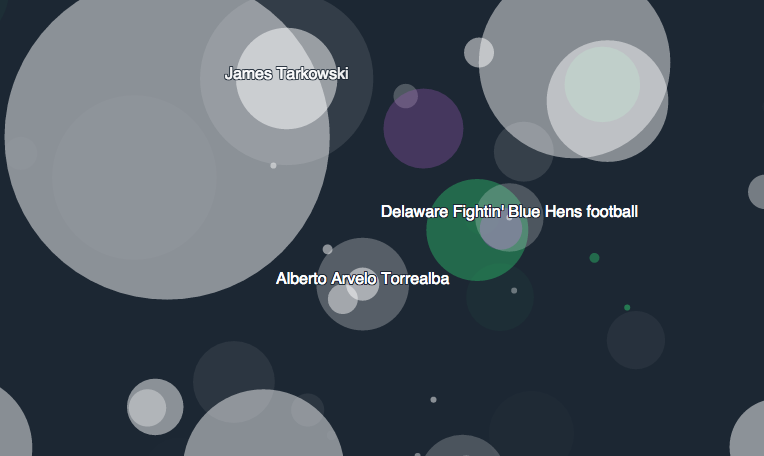 One particularly beautiful effort is "Listen to Wikipedia," which renders edits being made in real-time both visually and socially, and the effect makes surprisingly relaxing ambient music. The project was put together by Stephen LaPorte and Mahmoud Hashemi, and based on a similar project titled "Listen to Bitcoin" (the website for which is no longer active).The Listen to Wikipedia website explains how the music is created: "Bells indicate additions and string plucks indicate subtractions. Pitch changes according to the size of the edit; the larger the edit, the deeper the note… You may see announcements for new users as they join the site, punctuated by a string swell. "
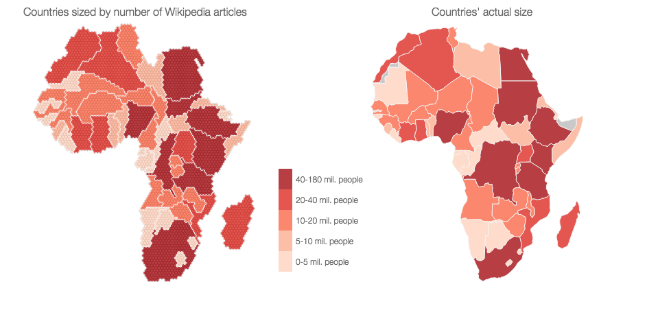 On the more informational and instructional side of things, you have "Africa on Wikipedia," which highlights the continent's relative invisibility on the site.Made by a team at the Oxford Internet Institute (which makes a lot of cool stuff), "Africa on Wikipedia" sorted through an article dump in 2013 and filtered for articles in all languages related to distinct geographic "places" like towns, forests, and festivals. The results show how certain countries in Africa hog a disproportionate amount of data related to their actual size, and in some cases their populations as well. Their analysis also found that despite having roughly 14 percent of the global population and 20 percent of the land, Wikipedia articles about Africa only accounted for 2.6 percent of all Wikipedia articles written.
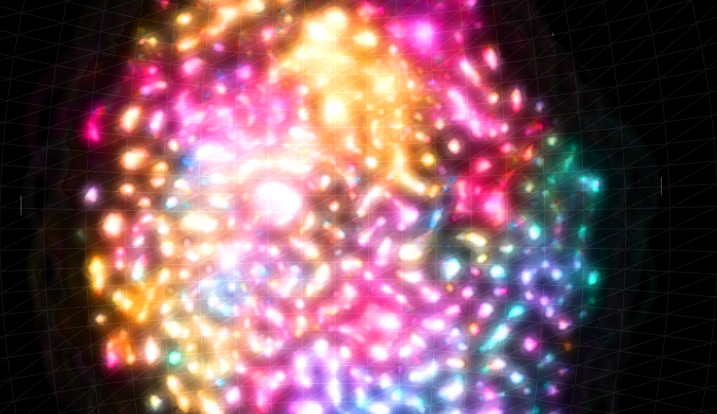 Then there's WIkiGalaxy, which is both beautiful and informational, and frankly has to be experienced to be believed. It organizes the 100,000 most popular Wikipedia articles of 2014 like a galactic system you can fly through, and might be the most incredible data visualization project I can ever remember seeing.So take some time today to peruse these projects and reflect on how lucky we are to have Wikipedia around. It's hard to imagine the world without it.
Advertisement